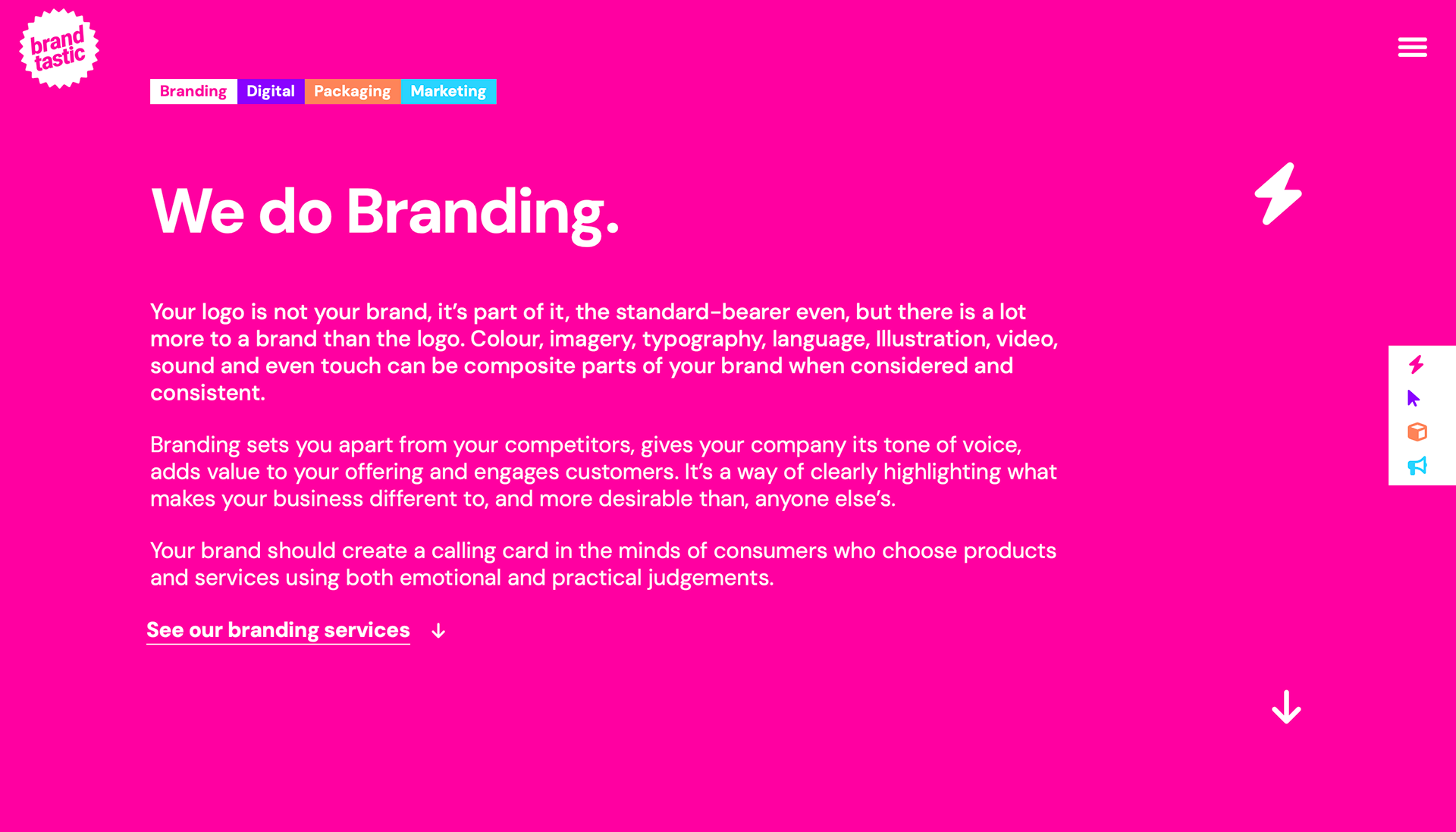
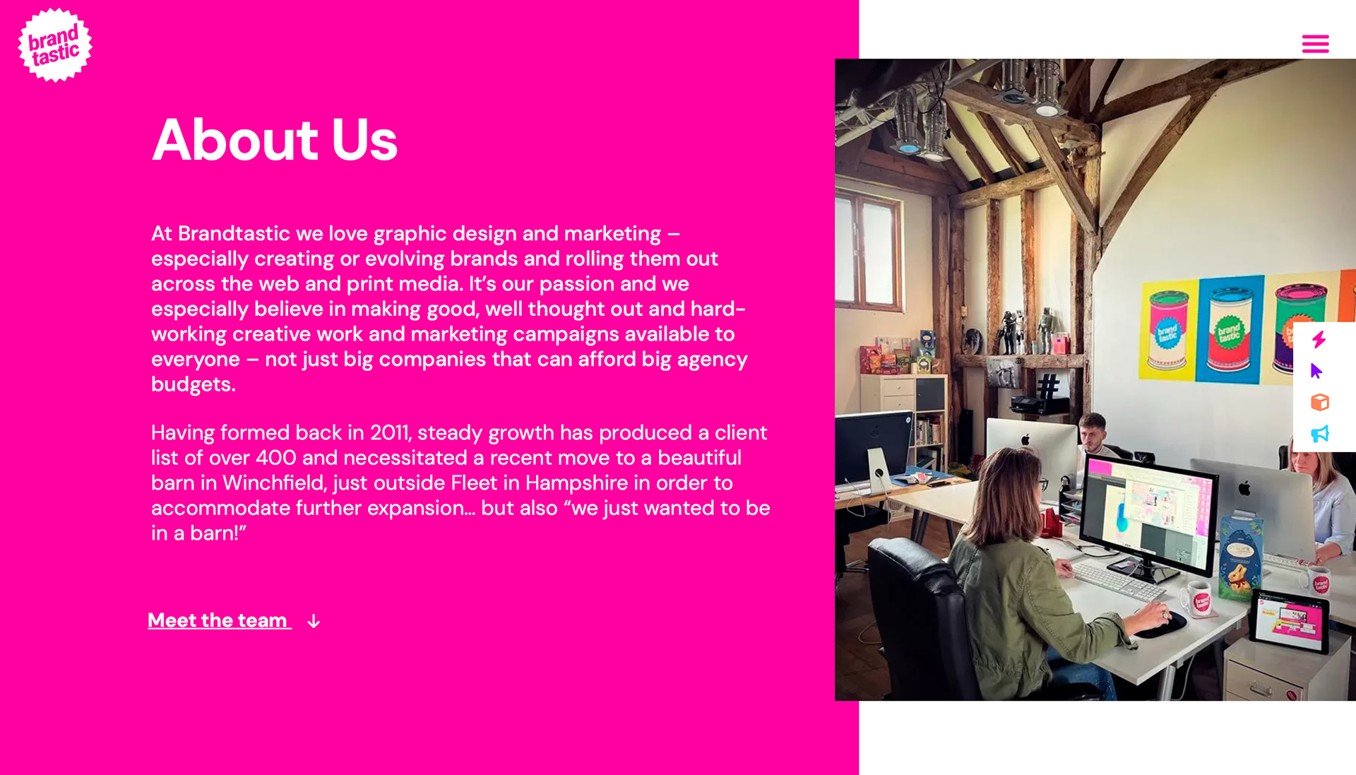
I spent a week with Brandtastic, a graphic design company, specialising in branding and web design. During my time here, I was lucky enough to work alongside experienced graphic designers, learn and improve my skills and knowledge, and experience working in a real industry environment.
BLACKFRIARS
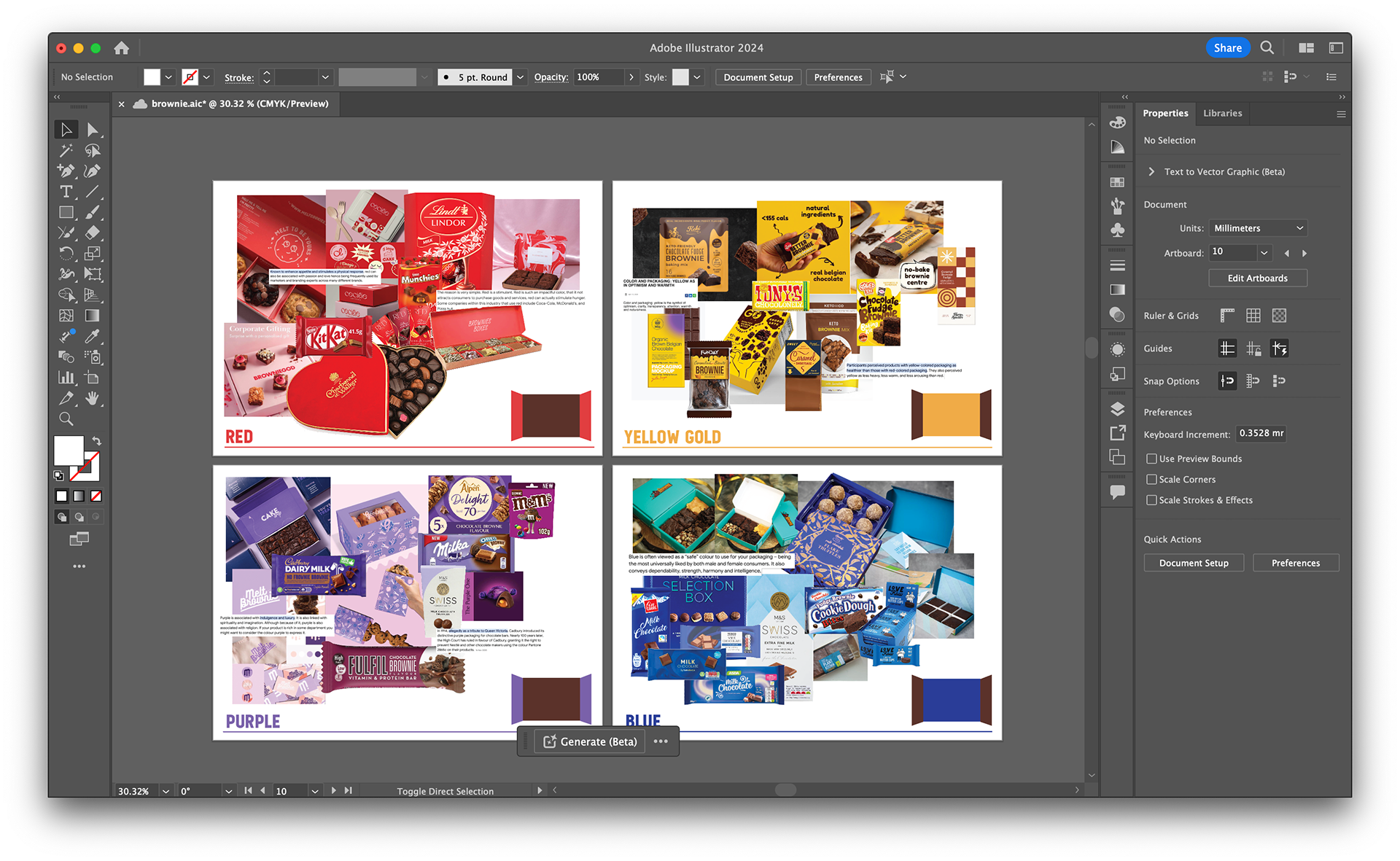
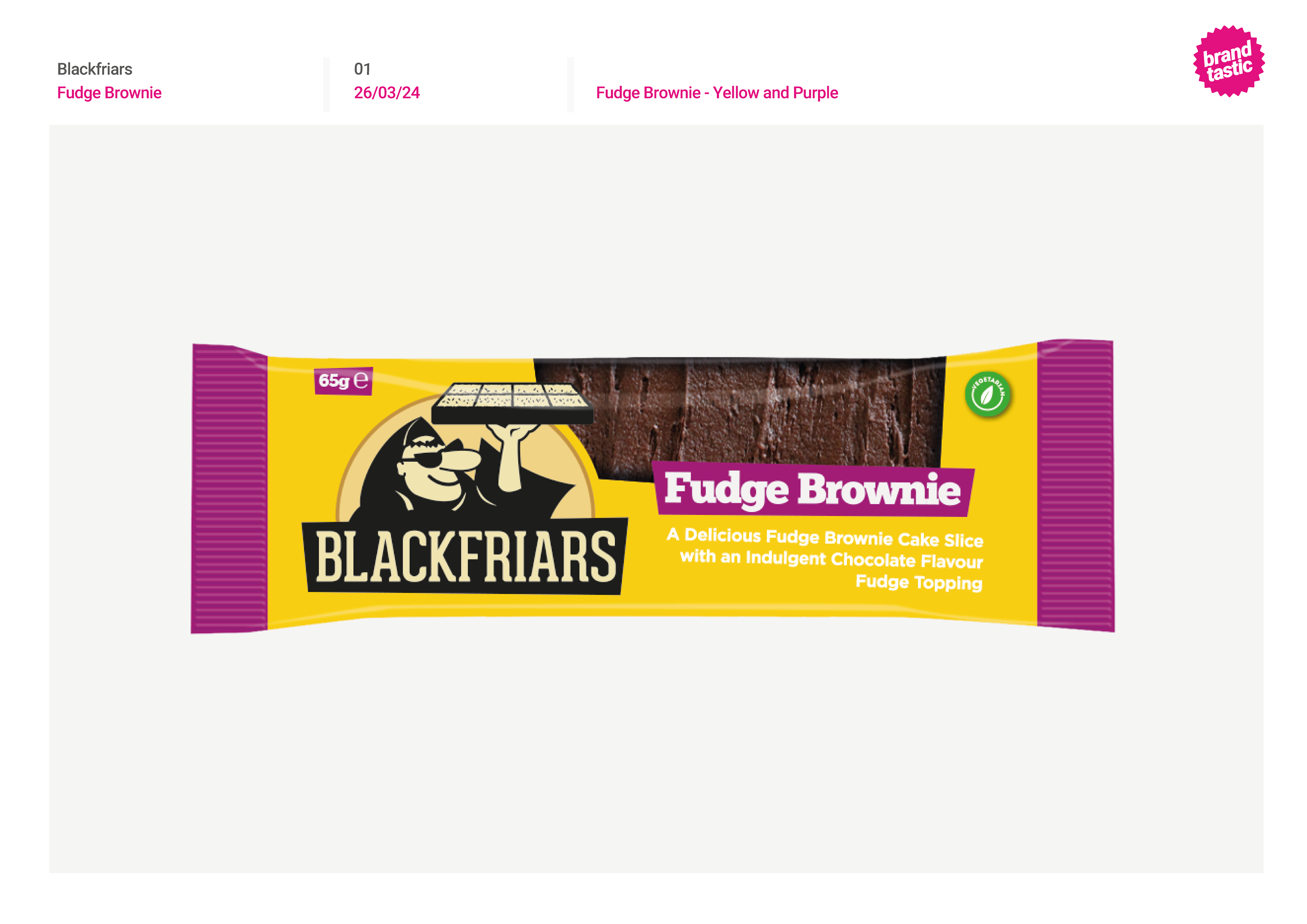
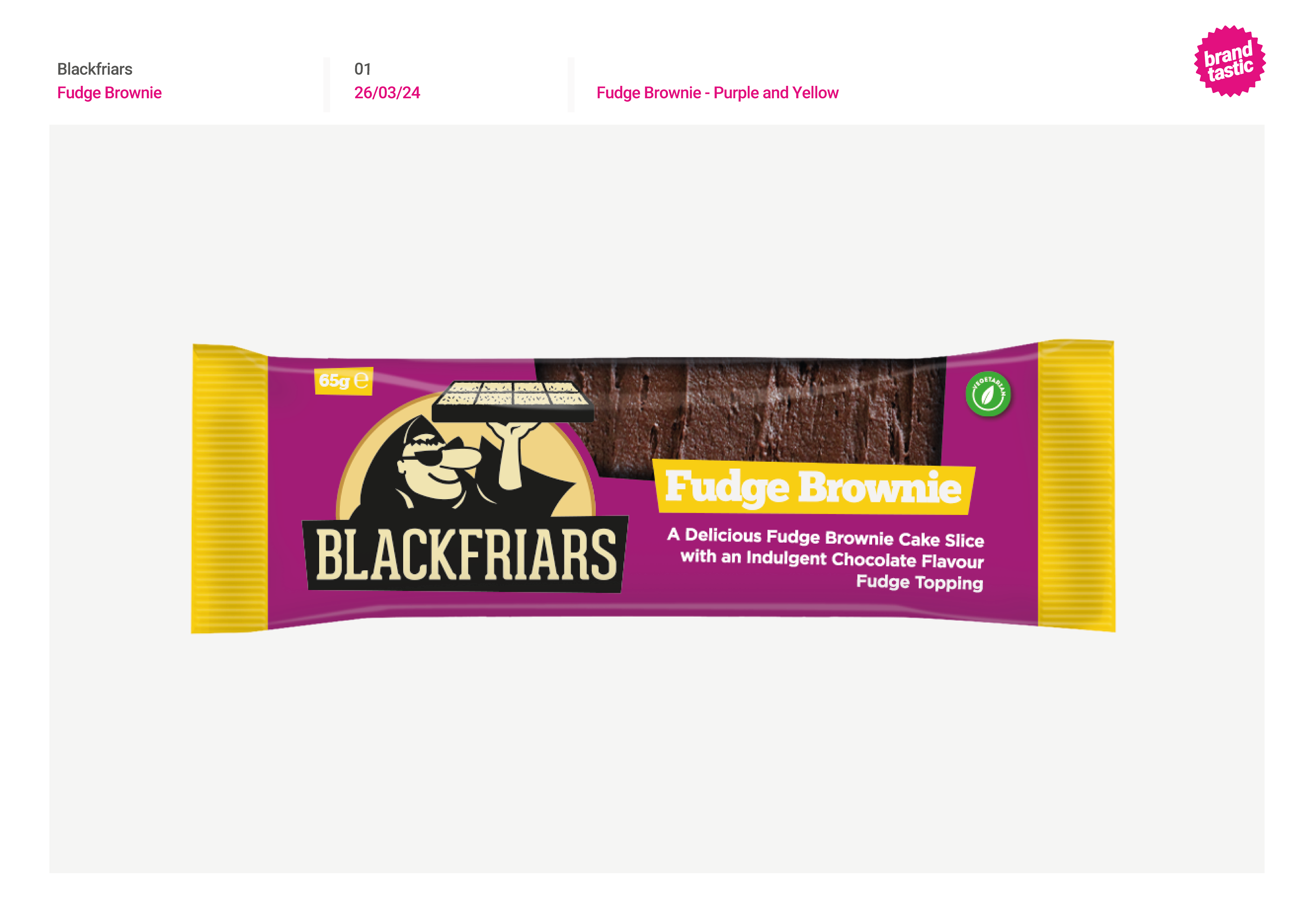
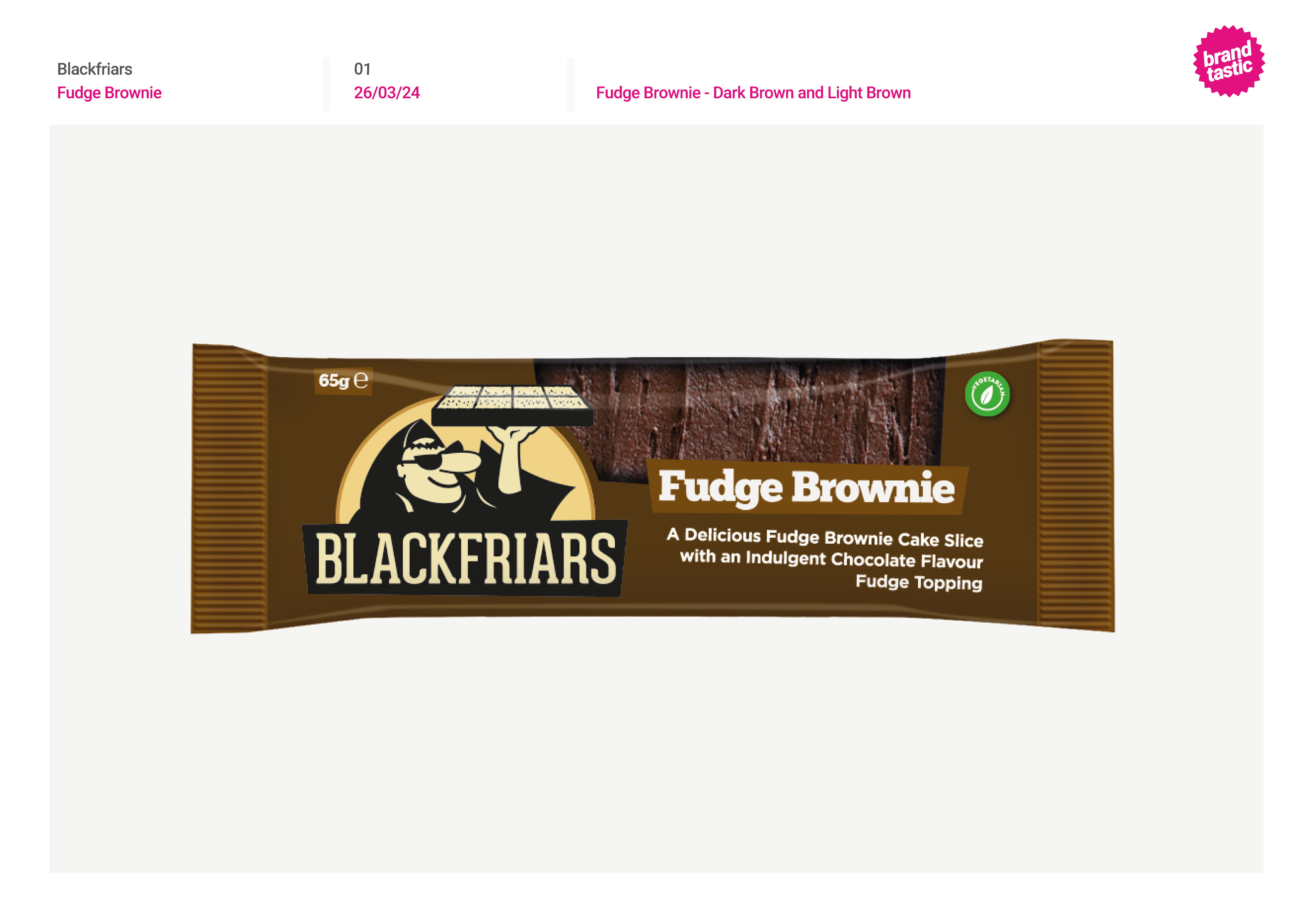
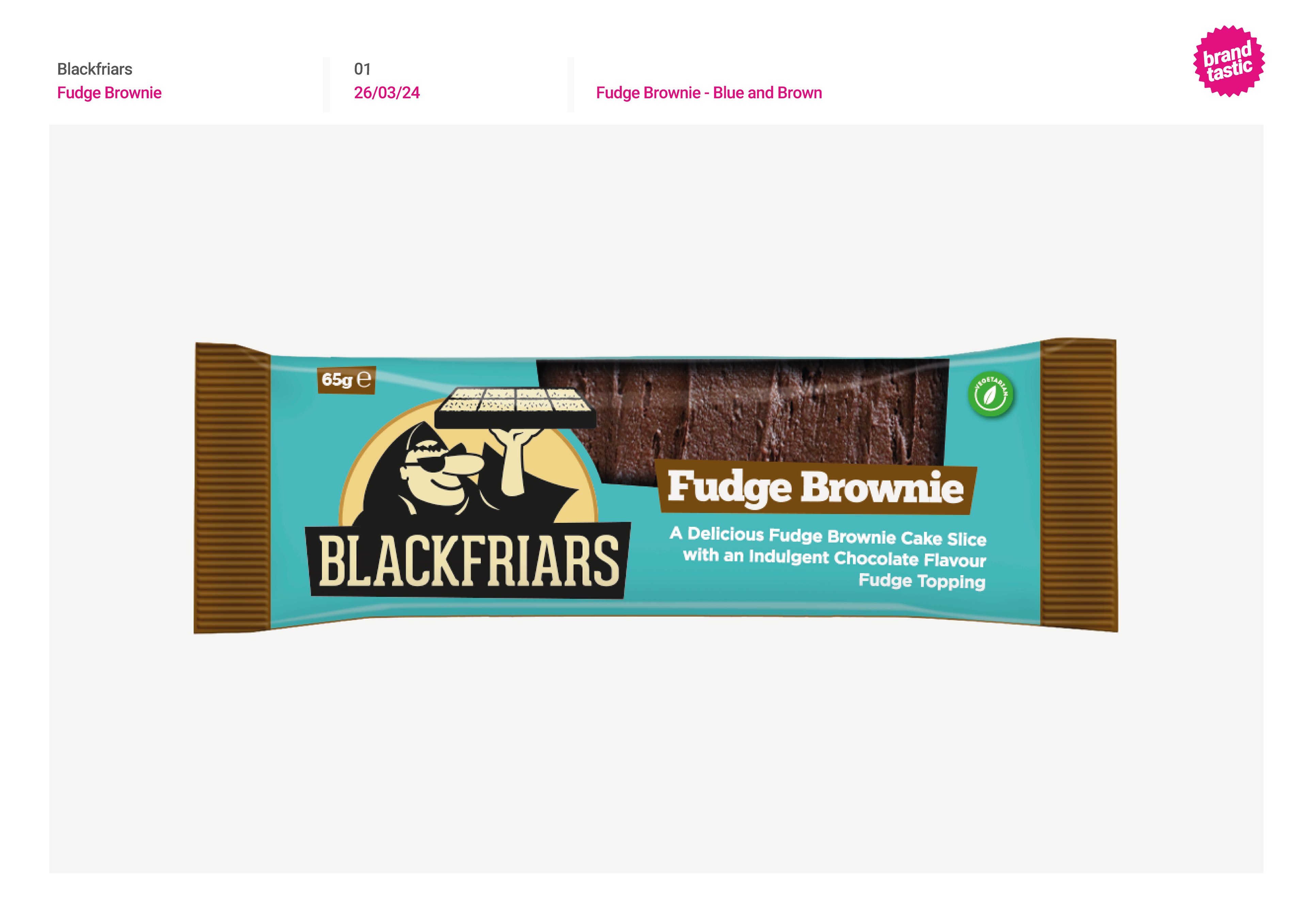
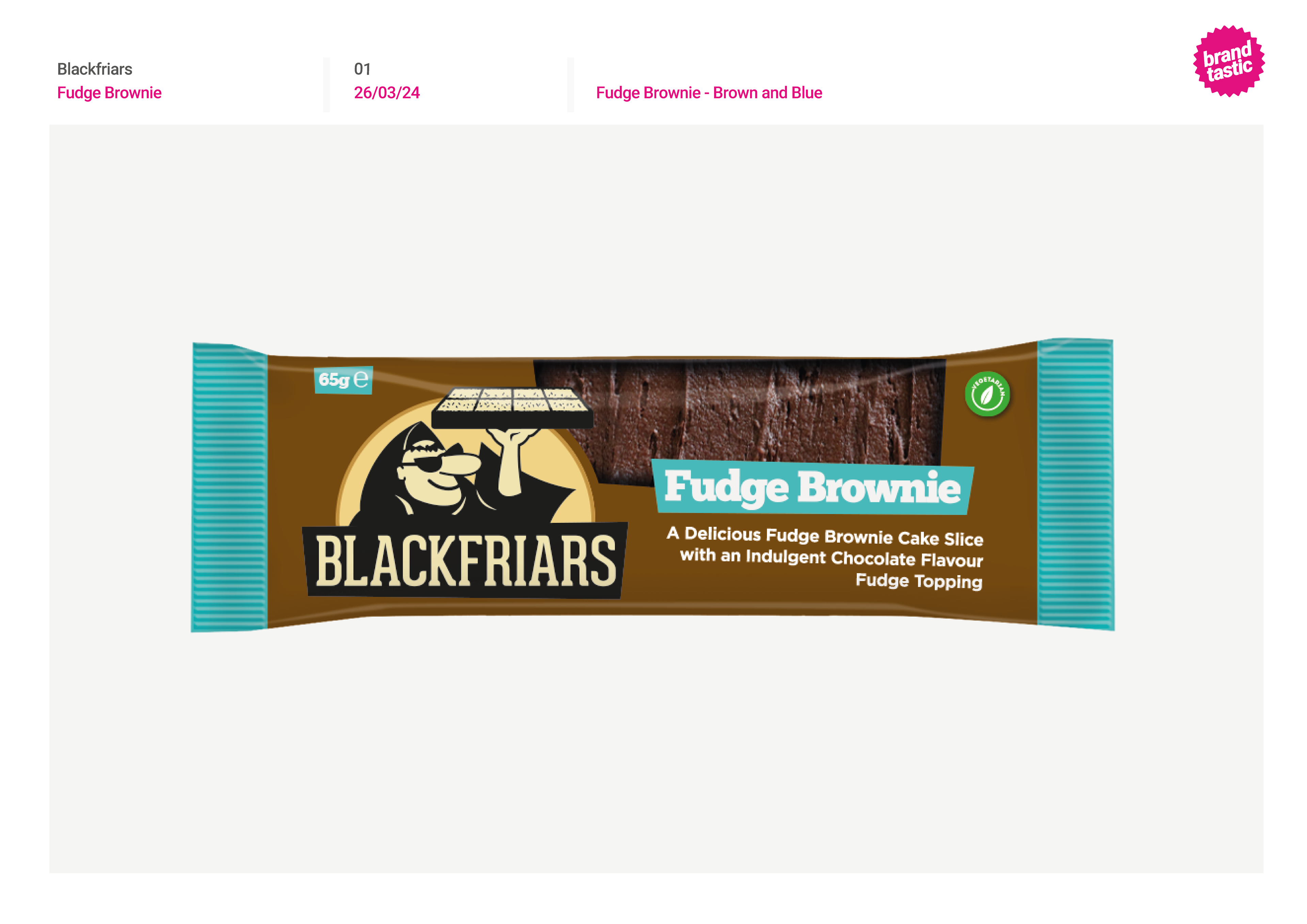
I was able to get involved in real projects they were working on for clients which was really valuable to see how it all works. The first project was for Blackfriars - a long shelf life bakery company who Brandtastic had designed for previously. They needed packaging for their new fudge brownie, and in the brief specified they liked yellow/purple colours.
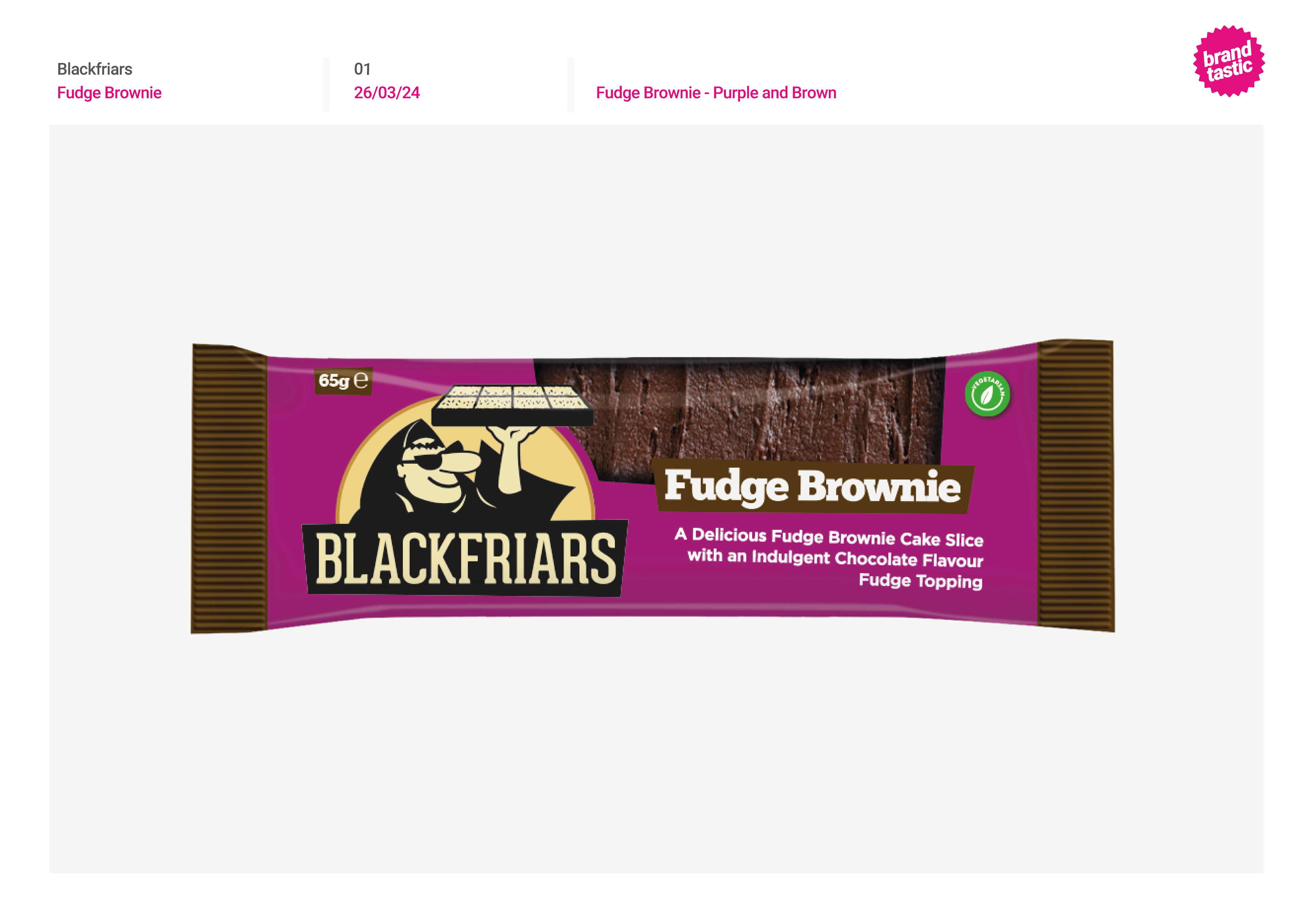
My job was to research colourways, and present 4 options in a mood board. After feedback, I went forward with the chosen colours and experimented with different shades of the colours and combinations.
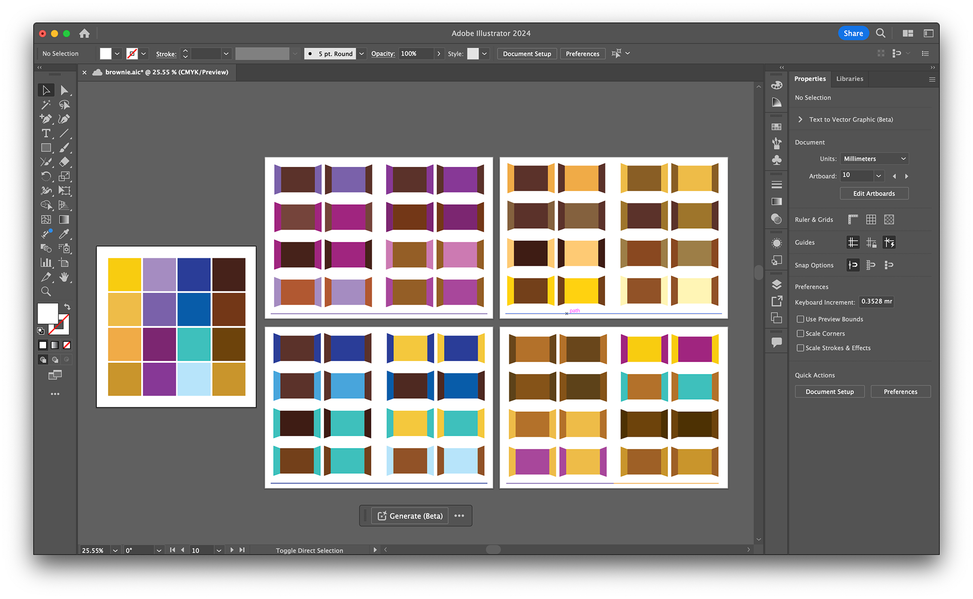
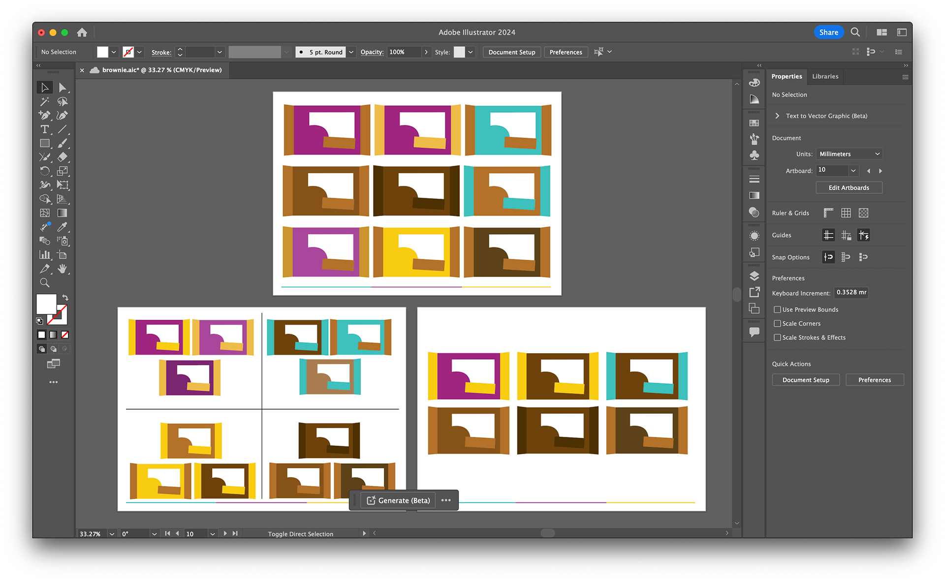
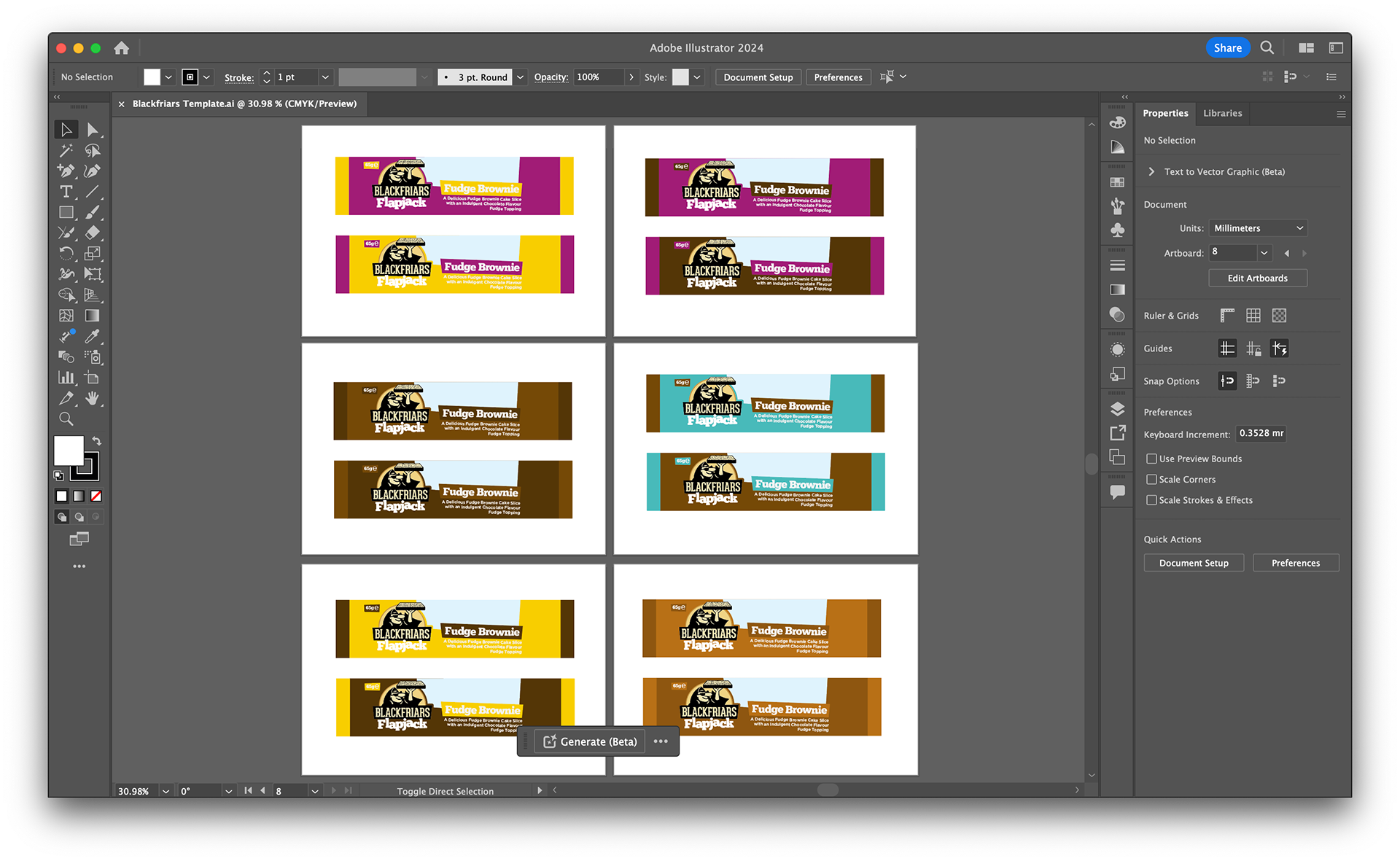
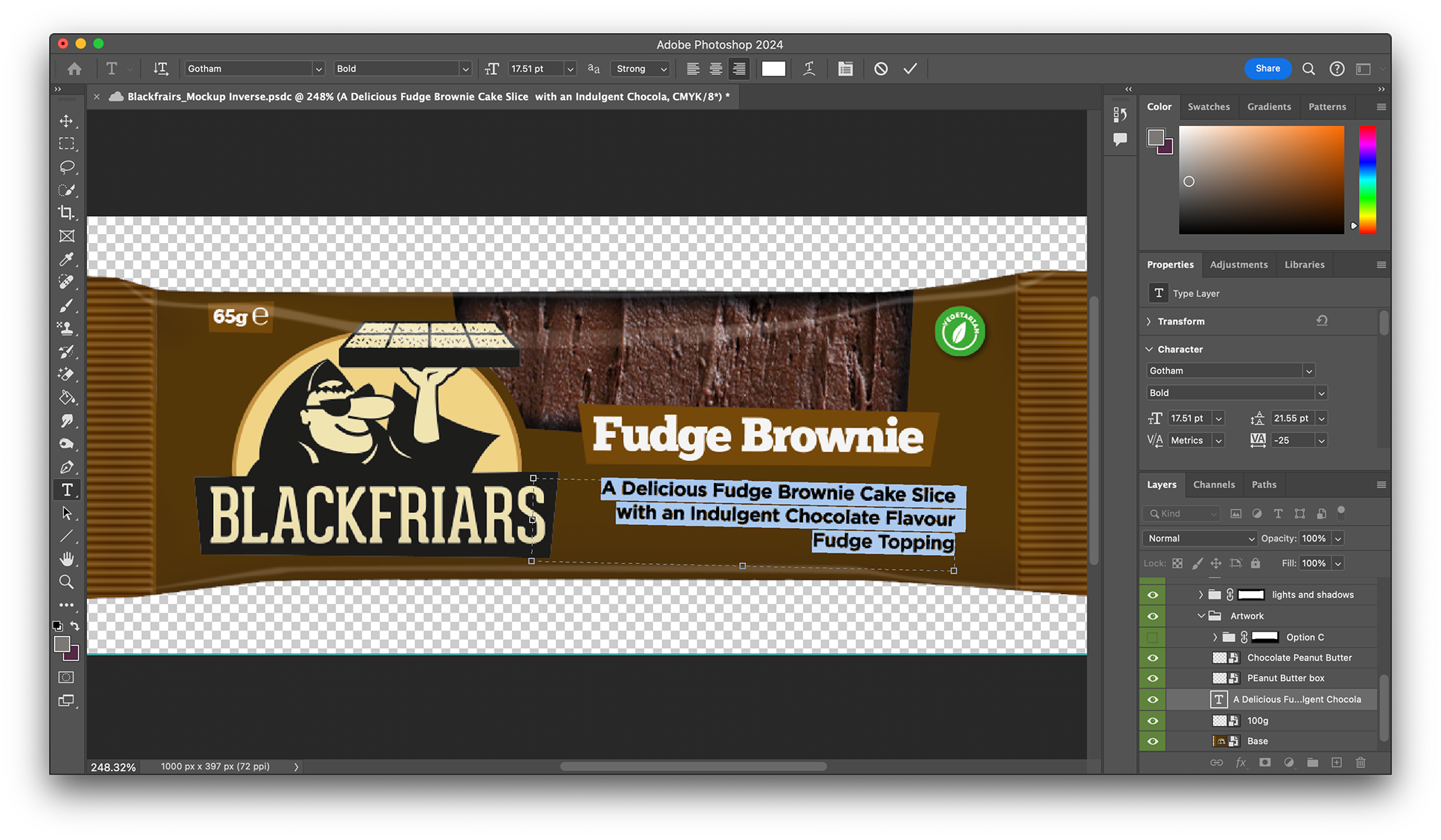
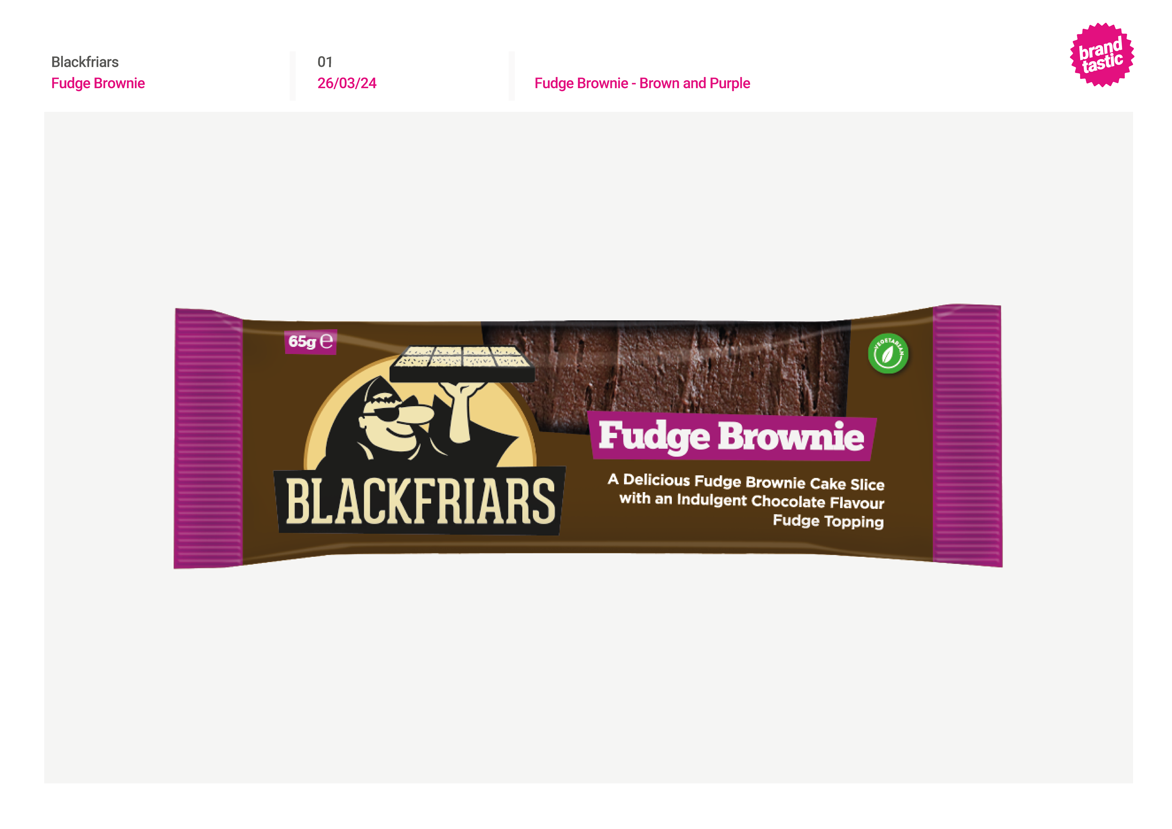
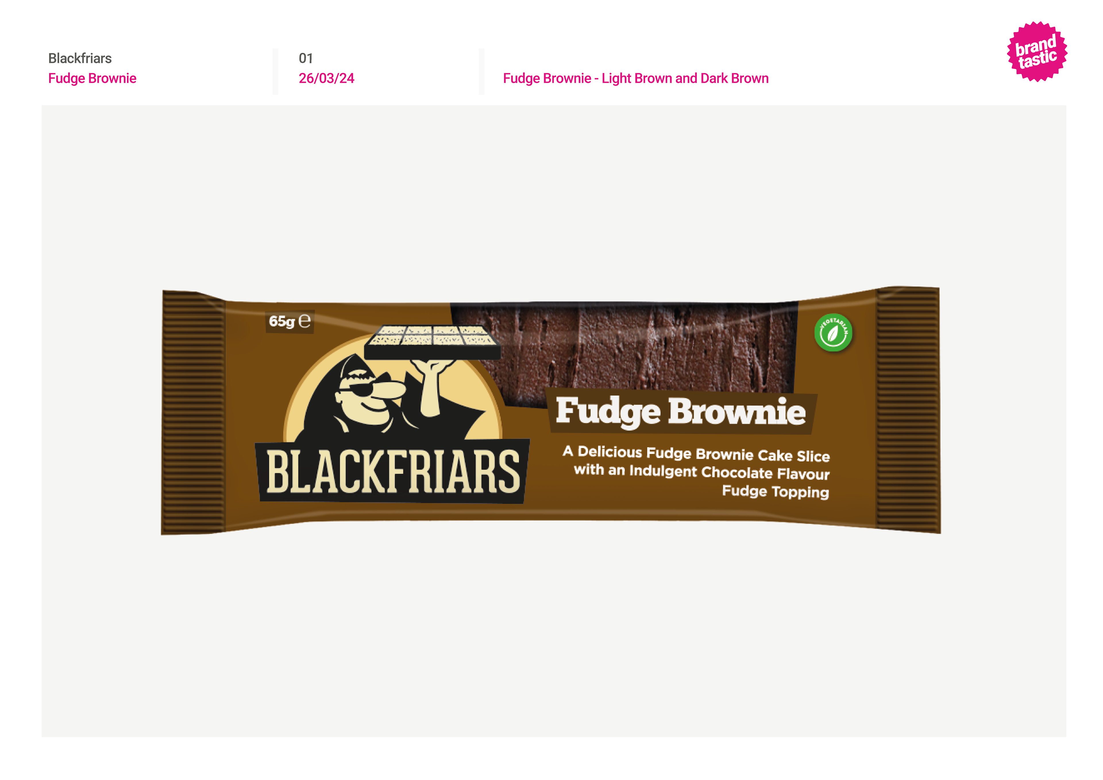
I was given the template for the existing flapjack packaging, to edit into brownie packaging. I removed the flapjack lettering and resized the logo to make it evenly sized and spaced. I then began to experiment with successful colourways, including the inverse. This made it easier to visualise what the end product would look like.
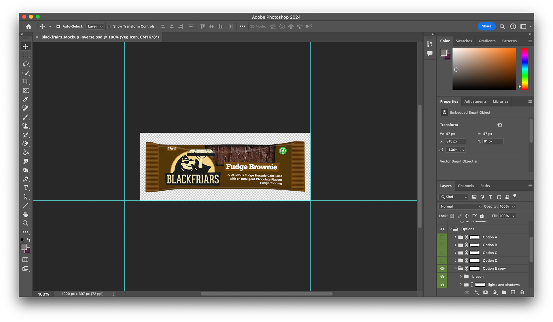
Finally, layer by layer I put the designs into a photoshop mockup to visualise the end product. With each colour way, I presented these on the brand board to send to the client.
PABULUM
For the next brief, school catering company Pabulum needed 6 posters to advertise daily food options. They sent over each food option with all the information that needed to be included, with recommended fonts and general requests for the posters.
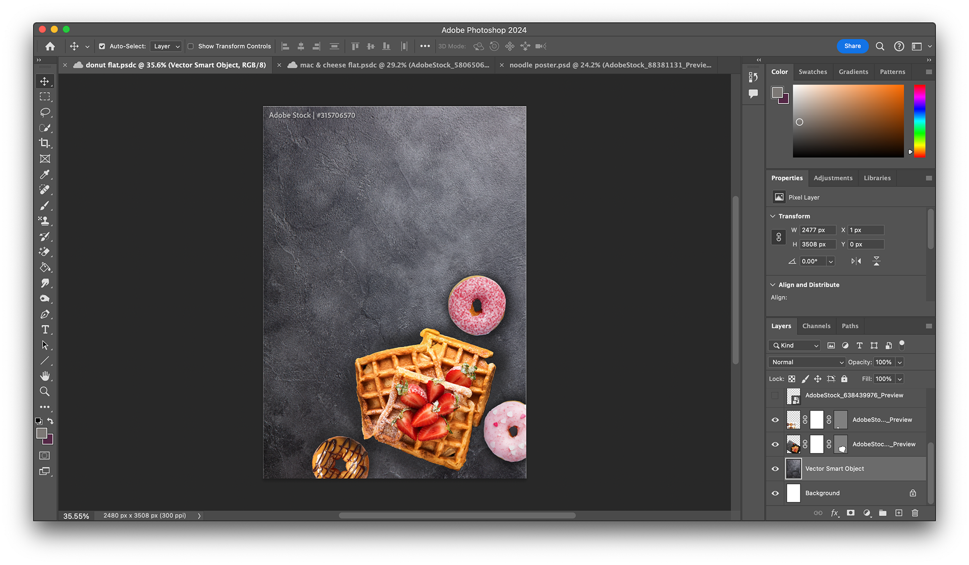
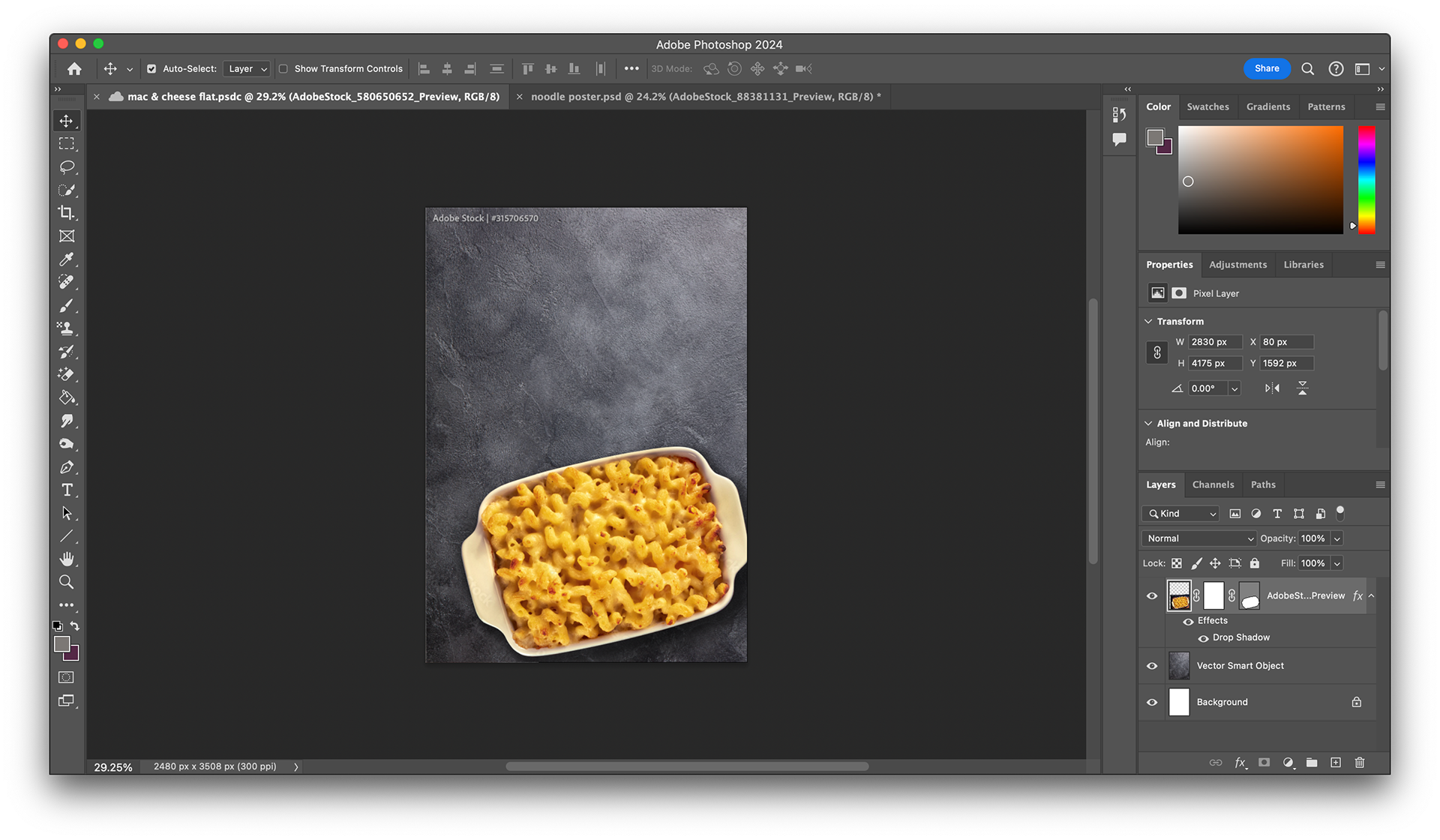
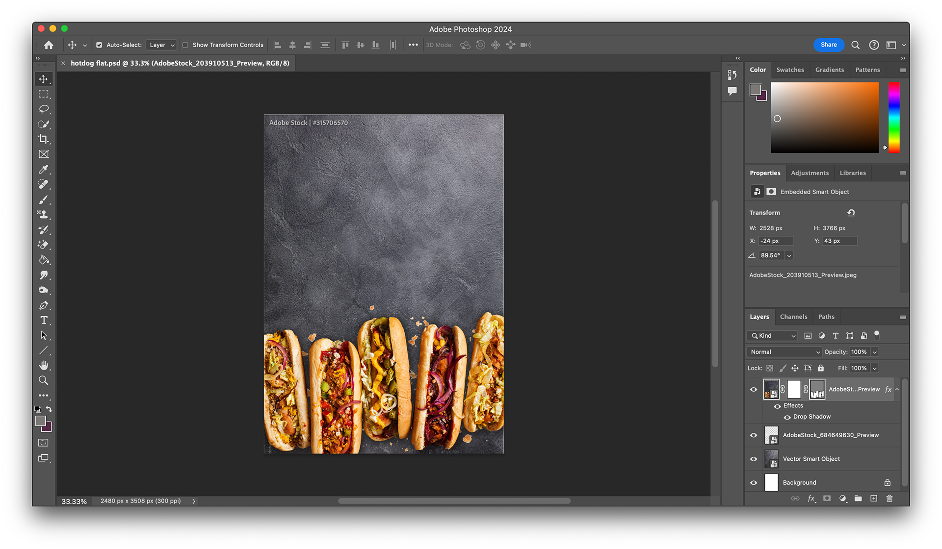
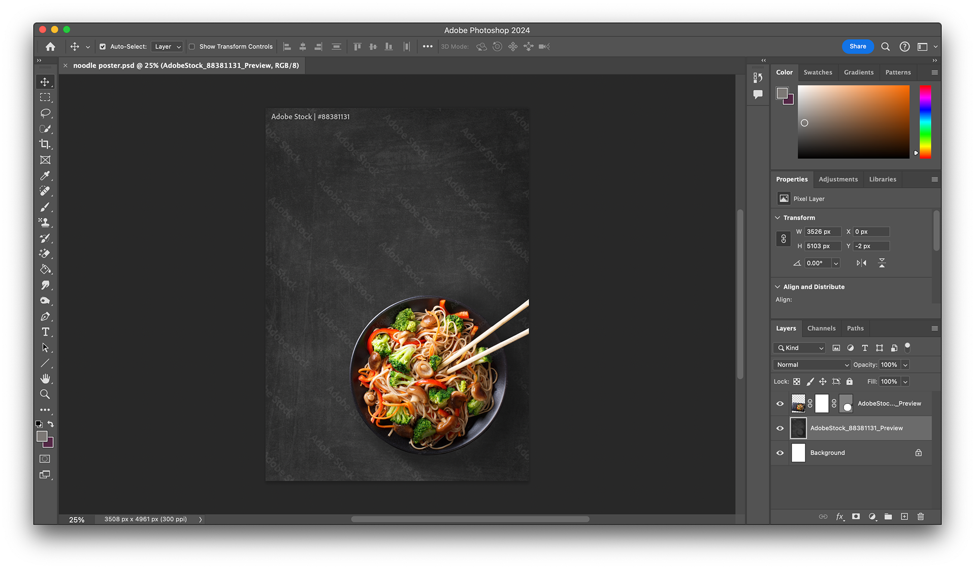
I began by researching suitable imagery for each food type, and cutting them out in Photoshop to experiment with on a background to create initial poster ideas.
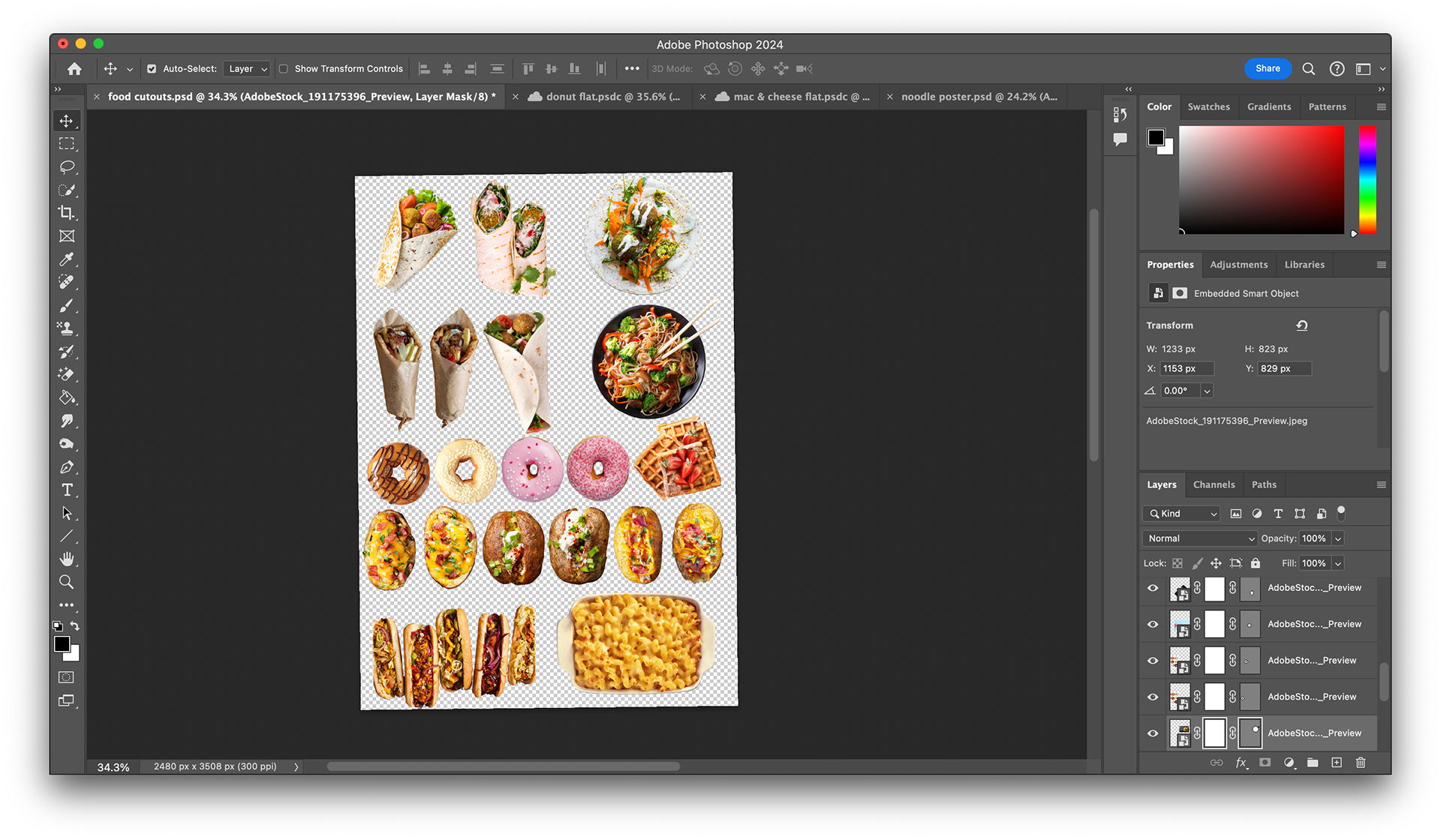
After this, I experimented with different backgrounds in Photoshop, adding shadows and light to make it look realistic. After feedback, we decided to continue with the noodle bar option to create an example poster to send to the client.
I then researched the fonts the clients suggested. They wanted either the chosen fonts or similar, so I searched on Adobe Fonts for more options. I found a few, so I experimented with these. I included all the relevant information in different forms of hierarchy. I created a few options to share.
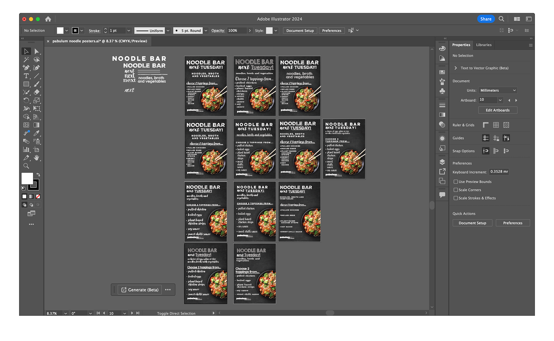
I then sat down with Dan, the managing and creative director, to show him the outcomes. He took aspects from a few of the posters, and worked them into one final design. I found this extremely valuable hearing his feedback, and seeing how he changed and improved the design to make it ready to send to the client.
Overall, I am so grateful for the opportunity to have experienced working in this environment, and it has really inspired me in my graphic design career!